Learning from Trump’s Weather Map Fiasco
This week President Donald Trump provided an important lesson for anyone gearing up for a business presentation: only present rock solid data.
The Mysterious Line
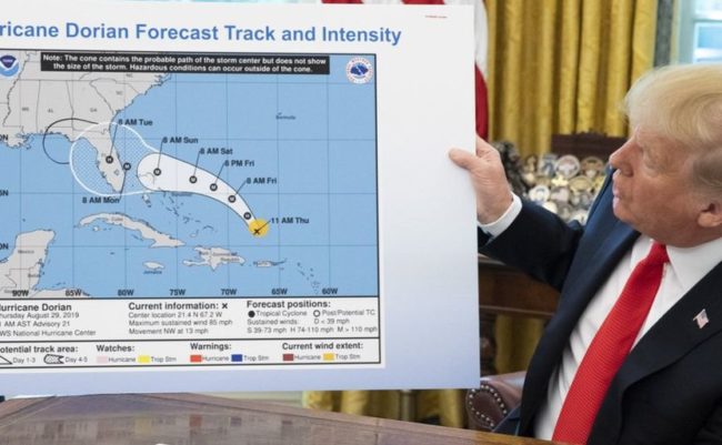
During a press briefing on Hurricane Dorian, Trump held up a weather that featured what appeared to be a black line drawn by hand. You can see the chart here:
The Reaction
People quickly attacked, noting that the line appeared to be a hand-drawn addition, perhaps by Trump himself. Trump is a known fan of Sharpies.
Comedians had a field day. Jimmy Kimmel observed, “He’s not even trying to hide the lies anymore. Not only do we have fake news, we now have fake weather, too.” Steven Colbert commented, “He gave the storm a boob job.” You can watch Colbert’s very entertaining clip here.
On Twitter, the hashtag #sharpiegate has been trending. People are lampooning the map and Trump.
The Learning
There is an important lesson in this incident. When doing a presentation, you should be very careful about the data you show.
If you present debatable information, you will get questions, especially if you are presenting to a hostile audience. In Trump’s case, it was a weather map. Someone doing a business presentation might get questions about a revenue figure or a pricing estimate.
When creating a presentation, it is critical to only include information that is rock solid. If you get a question, you should be able to explain exactly what a number means and where it came from. When you get a question on market share, you should be ready to go: “That share figure is an IRI number, YTD through August 26. It is a dollar share. The 18.2% is up +0.2 points vs. last year and up +0.1 vs. our latest forecast. The most recent four weeks were even better, with a share of 18.6%.”
Remember, there is no rule that says you have to include a certain piece of information. If you aren’t sure about a figure, or if you find yourself modifying the data (or drawing lines), don’t show it at all.
For more advice on creating powerful business presentations, check out my new book: How to Wash a Chicken – Mastering the Business Presentation.

Hilarious and accurate lesson, Tim. I already watched and loved Colbert’s take on it. But DT heeds no lessons and observes no facts that contradict his opinions or wishes, so maybe not such a good example.